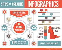
As a publisher of drone news, we receive story ideas from drone manufacturers, software and service providers, and analyst firms. More and more these ideas come in the form of infographics, “a visual image such as a chart or diagram used to represent information or data.” Non-editable and typically concise, these graphics are used to quickly tell a story or explain a trend.
In explaining the popularity of infographics, Lifehack.org provides the following:
“With the hectic schedules and the hustle and bussle of urban life, more than ever people have short attention spans. This is shown by the actuality that most people decide to explore or leave a site in just 2-4 seconds upon viewing a page. With such a short time frame to persuade visitors to hang around, visuals and infographics are a better option to grab their eyeballs. Another reason is; many people are visually motivated, so infographics are easier to comprehend. By using captivating visuals, you can present complex information and be understood quicker compared to having just text.”
The challenge for a publisher is to tell a deeper story than the summary presented in an infographic. We have done a variety of stories on both the DJI Mavic and the GoPro Karma. Malek Murison does a nice job with “Comparison – The DJI Mavic Pro is Bad Karma for GoPro”
Recently, we received an infographic from Mediakix, a leading marketing agency comparing the Mavic and the Karma. So while we have your attention (for two to four seconds), here’s their comparative inforgraphic:
Alan is serial entrepreneur, active angel investor, and a drone enthusiast. He co-founded DRONELIFE.com to address the emerging commercial market for drones and drone technology. Prior to DRONELIFE.com, Alan co-founded Where.com, ThinkingScreen Media, and Nurse.com. Recently, Alan has co-founded Crowditz.com, a leader in Equity Crowdfunding Data, Analytics, and Insights. Alan can be reached at alan(at)dronelife.com